The world of ecommerce is constantly changing – as are consumers’ shopping behaviors. Your business can survive the shifts by remembering that just because something is familiar does not necessarily mean it provides the best experience for your user. By challenging conventional user flows and design treatments, your business can stand out from your competitors and get more conversions. In this blog, we’ll explore an A/B test success story where a major athletic apparel brand that generates over $1 billion in annual revenue was able to:
- Reduce friction
- Increase the overall number of cart additions
- Increase the quantity of items added to carts
…all through a strategically planned mobile A/B test. Read on for the full story.
The situation: A feature that added friction
The post-add-to-cart (post-ATC) modal is a common feature of ecommerce sites that pops up on a user’s screen after they add an item to their cart. The modal may include (but is not limited to):
- A product summary
- A list of express checkout options
- A direct link to cart
- A carousel recommender that cross-sells additional products
Depending on your audience, your users may browse multiple products and add several items to the cart, utilizing the cart as a Wishlist that they will narrow down before purchasing. However, a post-ATC modal being triggered every time an item is added to the cart can cause friction, as it becomes intrusive and hinders the user experience.
The hypothesis: Be less intrusive, get more items added to cart
The conversion rate optimization experts at ROI Revolution hypothesized that the brand’s post-ATC modal was distracting mobile users from browsing the site, especially because many users were using the cart as a Wishlist. The teams developed an A/B test to identify if replacing the design with a less intrusive approach would decrease friction and increase the number of cart additions.
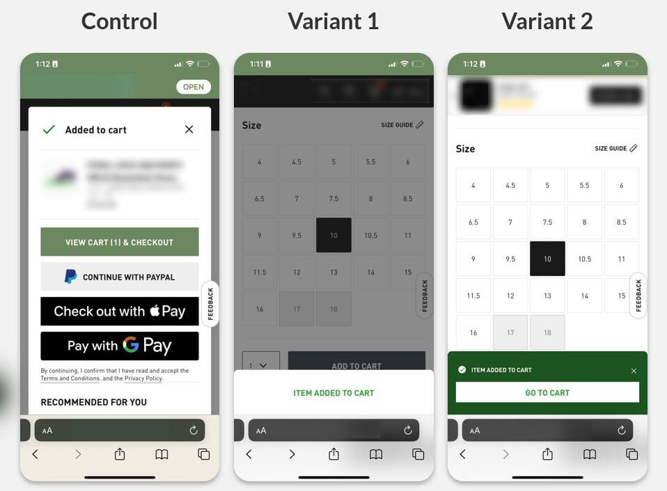
To test this hypothesis and see which version users preferred, the ROI Revolution team created two design treatments for the brand and ran a multi-variant test against the Control.

Control
When a user adds an item to the cart, trigger a post-ATC modal. The post-ATC modal includes a product summary, a list of express checkout options, a direct link to cart, and a carousel recommender. To dismiss the pop-up, users need to select the ‘X’ at the top right corner or click anywhere outside of the modal.
Variant 1
Disable the current design for the post-ATC modal on mobile devices. When a user adds an item to the cart, overlay a gray background and trigger a white banner from the bottom of the screen. Include a confirmation message for ‘Item Added to Cart’. Display the banner for three seconds before it disappears.
Variant 2
Disable the current design for the post-ATC modal on mobile devices. When a user adds an item to the cart, trigger a green banner from the bottom of the screen. In addition to a confirmation message for ‘Item Added to Cart’, include a button that allows users to navigate to the cart. Display the banner for three seconds before it disappears.
The results: More cart additions with higher quantity per cart!
Variants 1 and 2 both won compared to the Control! Both variants produced a 3% lift in cart additions and a 1% lift in quantity added to the cart – without negatively affecting transactions!
A holistic review of the results revealed that the hypothesis was correct: Some users utilized the cart page as a Wishlist, and the post-ATC modal was intrusive for users who preferred to add several items to the cart.
There was no measurable change in transactions, signaling that the test created a better user experience by eliminating a visual obstacle that blocked users from pursuing their intended behavior.
The brand decided to move forward with Variant 2, as it allowed users to navigate directly to the cart if needed and streamlined the user journey even more.
Tying It All Together: A $1B Athletic Apparels Brand’s A/B Test Success Story
A strategically planned A/B test can gift your brand with an understanding of how your users prefer to shop, ultimately helping you make more sales. The hardest part about running an A/B test is getting a winning result. In fact, the industry average win rate of an A/B test is just 12-15% – but at ROI Revolution, our conversion rate optimization experts are able to provide businesses with a win rate of 3x that!
To explore the profitable wins that your brand can discover, send a message to our team today.


