A quick search will yield thousands of articles filled with best practices for boosting your conversion rates. On sites where the average price point per product is higher, these often include adding features specifically for high-consideration like “Email Cart” capabilities.
At ROI Revolution, we believe in testing, testing, testing. Brands sell different products, using different pitches, and relying on different platforms. What works for one site does not always work for another – so test it!
In this week’s Try This Test installment, we’ll take a look at a site that sells higher price point products, provides a wide range of brand-name furniture pieces and sets with white-glove home delivery.
Situation
The higher price point of furniture products, combined with the anxiety that a physically large, style-related purchase can trigger, naturally leads to a longer buying cycle. 
We had a concern that users were using the shopping cart as an on-site comparison tool, and then leaving the site to do further price comparisons on the web. Potential customers were either abandoning the site, or upon return may have had to rebuild their cart.
Hypothesis
Adding a prominent “Email Cart” button to the cart preview modal will increase usage of this feature, which will increase stickiness of the website brand, provide a purchase reminder on a different platform (email inbox), and decrease general friction when/if the user decides to return to the site and purchase.
Treatments
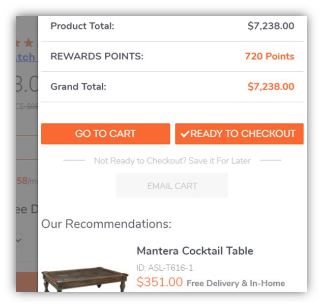
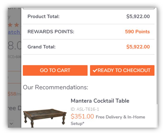
After adding a product to the shopping cart, the on-page cart preview modal is displayed. The original cart preview had no functionality for using the already-existing cart emailing feature.
Because the cart preview serves as the primary shopping cart for most customers, we focused here rather than the standard shopping cart page. A simple “EMAIL CART” button was added below the standard cart and checkout buttons.
Control:
Variation 1:
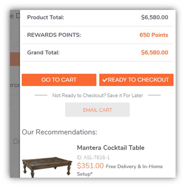
Variation 2:
Results
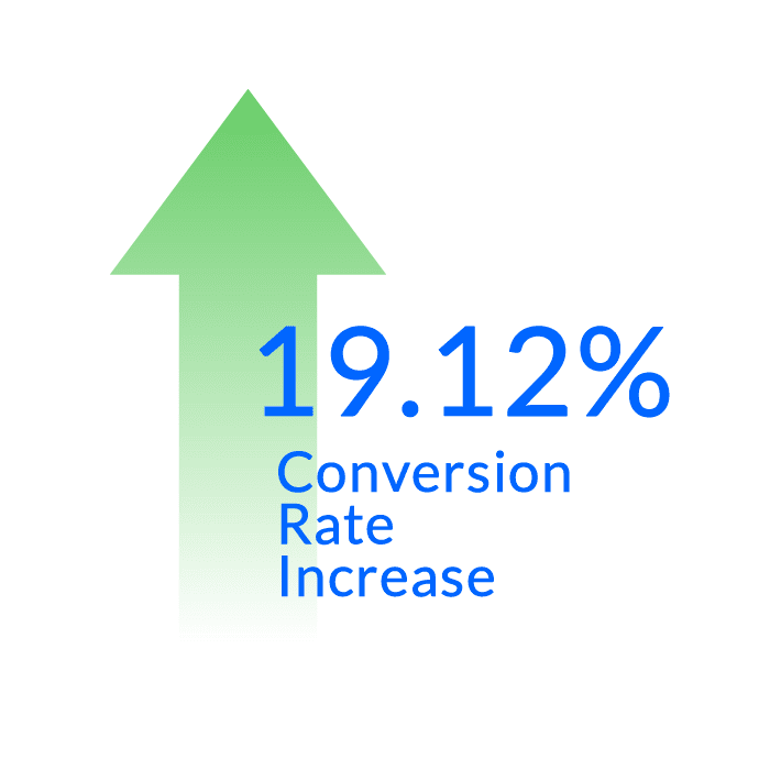
Variation 2, featuring the more subdued “EMAIL CART” button, had the best performance, with a 19.12% lift in conversion rate at a 93.8% confidence level.
Try It Yourself
Do you provide high-value products that naturally have longer buying cycles? If so, you run the risk of losing mindshare as the buyer performs comparison shopping across the web.
To increase stickiness and ultimately increase conversion rates, try testing an “email cart” feature on your site.
This was the last post in our Try This Test series! We hope you enjoyed it. If you missed the first five posts in this series, you can check them out below:
If you missed the first five posts in our series, don’t fret! You can check them out below:


