As marketers, ecommerce managers, and merchandisers, we keep a watchful eye on our messaging, pitches, and style guides, but are we addressing our customers’ underlying user experience questions when they visit our websites?
Well-defined customer personas help us dial in our voice and value proposition with laser focus. Shopping platform plugins are implemented to boost lifetime value (LTV), average order value (AOV), and lots of other acronyms. However, the question remains. Are we putting the proper emphasis on user experience?
While all of these metrics are important for providing a consistent brand experience for prospects and customers, they can be rendered ineffective by simple design mistakes.
Before your customers even have a chance to learn the merits of your product or service, within milliseconds, they’re making snap judgments while trying to figure out how to use your website. Good design decisions reduce friction and frustration and ensure that your message lands every time.
COVID-19 + User Experience Update
 Have conversion optimization best practices shifted much during COVID-19? Not much. The fundamentals of UX and consumer psychology still apply. There are, however, some important notes to keep in mind when testing and optimizing a site with regards to the coronavirus.
COVID-19 only needs to be addressed if operations are tangibly effected. A banner at the top of the site denoting delivery updates for a local produce subscription makes sense and is helpful to users. The same banner at the top of a SaaS company website, not as much.
There is no need to distract a user who may have otherwise been motivated to convert.
If your response to COVID-19 doesn’t effect operations significantly but speaks to your core values or a unique selling point of your business, try A/B testing your messaging. Keep in mind any changes you test will likely be most impactful near where users are making decisions, like near an add-to-cart button, form submission, or similar.
Be transparent about availability and shipping times. Users are understanding of delayed shipping times and availability issues. Shipping delays can be communicated either sitewide in a banner or on product pages. Communicating shipping delays upfront can reduce order cancellations.
With widespread supply chain issues, many retailers are experiencing stock issues. Product availability should be visible on the product list page and users should be able to filter for only in-stock products. Making users click into a product only to find out it is not in-stock is a bad experience.
To capture some lost revenue for out-of-stock products, consider offering a pre-order option for popular out-of-stock products. Alternatively (or in addition) to preorder, offer users the option to sign up for alerts when the product is back in stock. This is a great way to build email and phone lists.
7 User Experience Questions Your Customers are Asking
In the rest of this post, we review seven common questions that your customers are asking when they first arrive at your site (whether consciously or subconsciously) and how those questions impact your site design and overall user experience.
If the answer to any of these questions is unclear, you have identified an area for user experience optimization.
Question 1: “What Am I Supposed to Do on This Page?”
Common Design Mistake: Unclear Call to Action
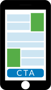
 The call to action (CTA) is the primary action that you want the user to take on the page.
For example, on a product page, the CTA would likely be the “Add to Cart” button. On a landing page for a lead generation site, the primary CTA could be to start a form submission or make a phone call. For the homepage of an ecommerce site, it might be to click on the top navigation or visual navigation.
Think about the action you want users to be taking on the page you’re optimizing.
Best practices:
- The primary CTA should be clear and immediately draw the eye.
- Competing visuals and secondary CTAs should be de-emphasized.
- There should be a single, visually defined “action area” on the page where user interaction will take place.
- The action area should have a headline stating its purpose.
- The page should have a prominent headline stating its purpose.
Question 2: “What Am I Supposed to Do First?”
Design Mistake: Too Many Choices
People are less likely to make a decision if they are overwhelmed with choices. High-converting pages limit choices to a few clear options and clearly display the relevant details of each choice. Overwhelming your customers with options may seem like a good idea but will ultimately not benefit your conversion rate.
Best practices:
- Granular detail should not be presented too early.
- Related choices should be grouped together into categories.
- Use visual shortcuts, graphics, and bullet points to reduce necessity for reading.
Question 3: “Where Do I Focus?”
Design Mistake: Visual Distractions
Similar to overwhelming your customer with choices, you can overwhelm them with visuals. Keeping the site visually uncluttered guides users to taking the desired action.

Best practices:
- Remove all graphical elements that do not directly support the conversion action.
- Dark background colors and decorated fonts should be avoided.
- Remove colorful page elements and motion (in most cases).
- Replace generic stock photos with relevant images.
- Avoid background patterns, embellishments, and flourishes.
- Avoid animations and auto-playing videos.
Question 4: “Does This Page Contain What I Expected It To?”
Design Mistake: Not Keeping Your Promises
Chances are, most of your users aren’t visiting your site by random chance. Most visitors likely clicked on an organic or paid link in a search engine, an ad on social media, or a link on another site. What language, verbiage, and promotions are you using in upstream marketing? Does that match what is communicated on your landing page?
Best practices:
- Make sure the page reflects the information and offerings from upstream sources, like CPC ad copy.
- If there is a promotion or sale in the ad copy or creative, it should also be on the landing page.
- Any information or functionality promised in the upstream sources should be easily available on the landing page.
Question 5: “Do You Really Expect Me to Read All This?”
Design Mistake: Too Much Text
It takes 0.05 seconds for users to form an impression of your site and 2.6 seconds for a user’s eyes to settle on one section of the page. During a study where participants were asked how they formed their impressions of webpages, only 6% of the feedback was about the actual content on the page.
Move long-form text to detail and informational pages. Focus on marrying headlines, calls to action, and critical information with solid visual design.
For more information, check out this great blog post from Conversion XL.
Best practices:
- Use clear page titles and headings.
- Use the “inverted pyramid” writing style, putting the most important information in the first line.
- Cut down text length as much as possible.
- Move long text blocks lower on the page or to supporting or informational pages.
Question 6: “Why Should I Give You All This Information?”
Design Mistake: Asking for Too Much Information
It is difficult to avoid the temptation of asking your visitors and users for more information like job titles, phone numbers, how they found you, etc. Each additional piece of information that you ask from users can decrease your conversion rates. This effect is especially strong if you are not a household brand.
Avoid asking for any information that isn’t absolutely necessary. Ask for information as late in the funnel as possible.
Best practices:
- Only ask for information that is absolutely required; the most important part of form creation is minimizing the number and complexity of fields.
- Shorten labels and de-clutter form layout.
- Clarify form purpose with a clear and concise title that describes the benefit the visitor will get if they expend the effort to complete the form.
- Organize form fields into logically labeled sub-groups.
Question 7: “Why Should I Trust You?”
Design Mistake: Lack of Trust and Credibility
If the user is not already familiar with your brand, it is all the more important to communicate the trustworthiness of your site on the landing page. Consistent modern design and social proof like reviews and testimonials will build trust with your users.
Best practices:
- Fonts, colors, and graphic elements should match and should combine into a single professional visual look.
- Remove all graphic elements that are not necessary to communicate the page’s primary purpose.
- Add social proof such as review stars, testimonials, media features, security icons, or guarantees to the landing page.
Questions Answered = Less Friction
If you happen to be in the middle a redesign or replatform project for your site, now is the perfect time to factor these very important user experience questions in to your layout. If your site’s design is set in stone, there’s always a little room for some extra chiseling.
And if you’re somewhere in the middle like most of us, any time is good time to review these user experience questions to see whether your site is presenting subconscious friction to new visitors. Give your content a jumpstart by eliminating barriers to entry!
But don’t just take your word for it or your employees’ word for it. Utilize user experience testing with individuals that match your target customers. This can be done in person or remotely using various testing methodologies and services.
This type of feedback can be invaluable, especially when you are intimately familiar with your site (which can lead to issue blindness). A true, first-time instinctual reaction is where you’ll get the most useful answers to the seven questions detailed above.
Looking for more content on conversion rate optimization? We’ve got you covered! Check out some of our CRO resources below:


